

Must’ve been a recent change because somewhat frequently I’m using it on the go and just now it started appearing for me.
Also banners appear on the top of communities now too. =D
The posts that I’ve seen so far seem to be lacking context that’s available when visiting the original on the home instance.
That is, these posts look like the first comment made by the OP in a thread below their main submission, but the main submission isn’t visible.
Very disorienting. I hope there’s a fix on the way.
Using Mastodon, it’s a similar behavior there, and equally mildly annoying. Least bad in that sense imo is Misskey, as when the post is a reply, the one it replies to is partially loaded, though Misskey has so much visual noise it is disorienting in other ways.
Is there a way to disable this? I’ve never cared for microblogs.
https://fedia.io/threads should do it.
But then you don’t see other content like photos and videos.
No this “threads” is just referring to everything that is not a microblog.
I don’t see anything on either https://thebrainbin.org/#settings or https://thebrainbin.org/settings/general, and on desktop it isn’t loading combined for me so I can’t test Ublock Origin filters either.
I honestly didn’t expect that there needed to be a setting for this… But I mainly/only use the “sub” feed, and if you don’t want microblogs there, just don’t follow people posting them 😅
I exclusively browse all, blocking magazines/communities that I really don’t want to see.
Yeah, that’s what I expected. I just don’t so I didn’t consider it…
I like it. Always wondered why it wasn’t like that from the start.
I’ve been looking into how to accomplish this too… because it is a UI/UX problem and I am very bad at designing user interfaces.
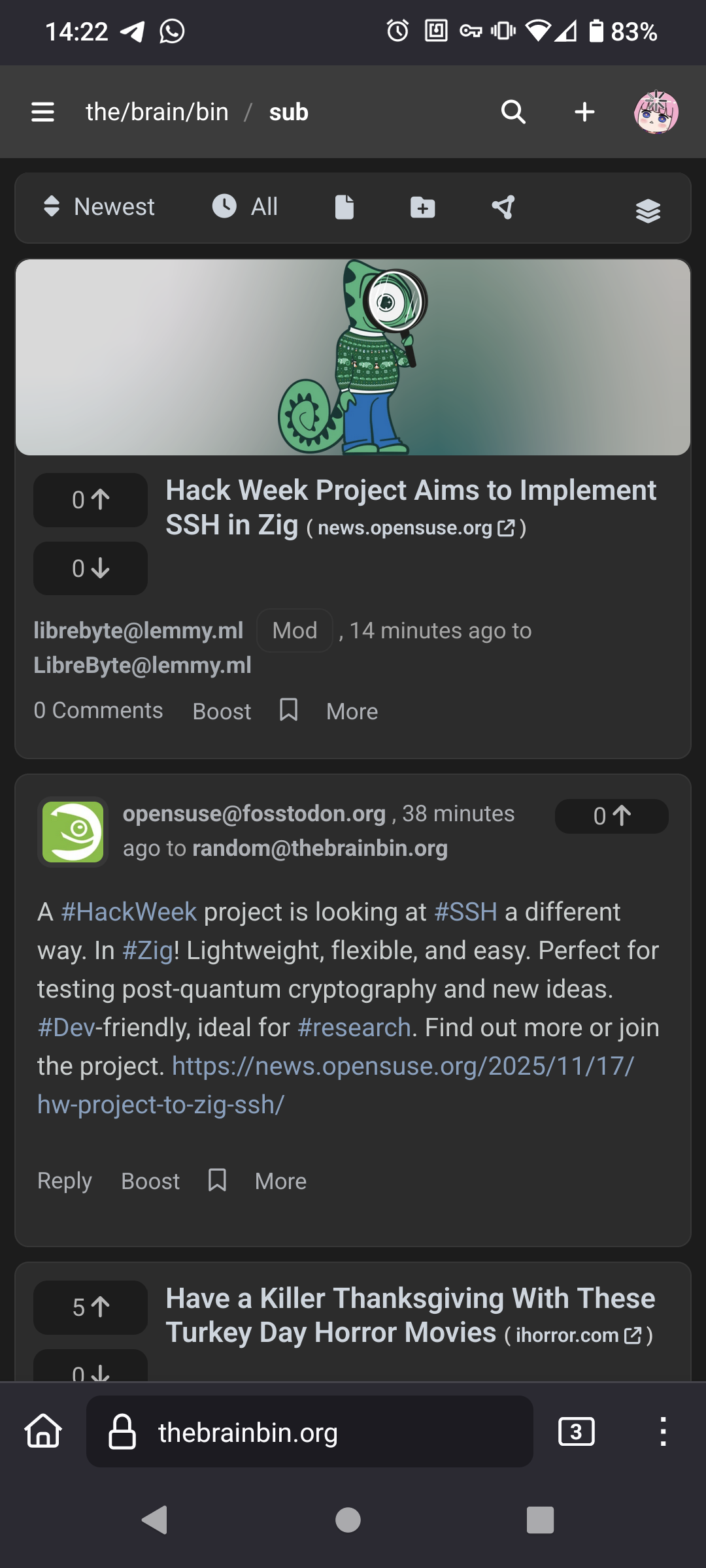
Mixing them like so works, although it’s hard because then it minimizes the size of topics (since it is just the title.) It means microblog content get a bit of a UI boost due to on screen size.
Limiting the max height of microblog posts and showing a snippet of the threaded content OP is another way, but that makes the page more feed-like and less of a “topic listing”, which isn’t always the way to go either.
For reference, NodeBB also mixes threads and microblog posts. We do this by generating a title from microblog posts. It’s not the best solution either.

