
Hi all,
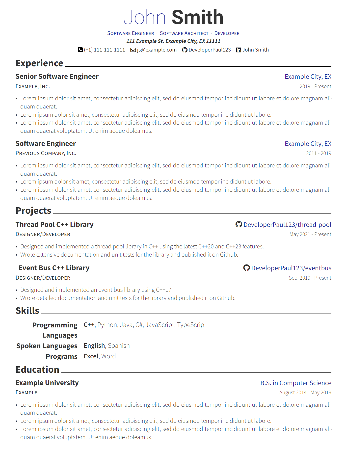
I made this typst template originally to port my personal resume to typst from Latex. It tries to be a faithful port of the Awesome-CV latex template that I was previously using. Hope you find it useful.
https://github.com/DeveloperPaul123/modern-cv
Edit: added missing link
Please don’t color part of a word blue and part of a word black
The world must know of my skills.
Exactly where my eyes went. Pro, Exp, … Ski?
Professional Experience
Education
Networking information
Inerests
Skills
This is interesting as I simply copied the same styling as the previous template I was using. Would it be better to highlight the entire first word instead of the first n letters?
Black only. Either bold or italics if you feel the need to add emphasis.
Most resumes are parsed by tools and you’ll never see fancy formatting anyways.
This type of resume isn’t for the tools, it’s for the humans who glance at the resume before the interview.
deleted by creator
Experience should be listed first. Education last.
You just don’t appreciate how prestigious it is to get a degree from Example U.
Thanks for the feedback! I think this makes sense for those who do have work experience. Do you think this should still be the case for new graduates?
Also I should note you can easily change the order of things in your own CV.
Idk if this common around the world but in Germany it’s because you sort from present to past.
You forgot to include a link to the project:
This looks good.
A few unsolicited nit-picky suggestions;
- I’m not a big fan of mixing colors in a single word. ‘Taky’ might the be the right to describe why. I do like the color blue you used - if you’re going to do it, make it the whole word. The name should also be consitent. Bold and either black or blue, not black and blue.
- The light blue and light gray body text is difficult to read. Colors should be solid black, or navy blue. Bright and ‘fun’ colors are heard to read for some. Assume they’re colorblind or will print it on a B&W printer with poor contrast.
- I like to lead with the job title instead of the company. Where you worked is largely irrevelvant compared to what you’ve done at those places. It also makes it easy to combine company, city and years in one line.
- start with previous jobs (unless education was most recent or more relevant to new job). Typically the order is job > skills > education.
- Avoid italics they can be unnecessarily diffuclt to read
Engine Mechanic
Bob’s Auto | City, ST | 2017-2021
Education does not need so many details (if relevant to job, include specific courses and projects). Grad date can be omitted to help obfuscate you’re age (a grad from 2024 is probably inexpirenced, while a 1967 grad is going to be retiring soon).
Two lines is all you need;
Bob’s University, City, ST
B.S. Computer Science, minor electrical enginnering
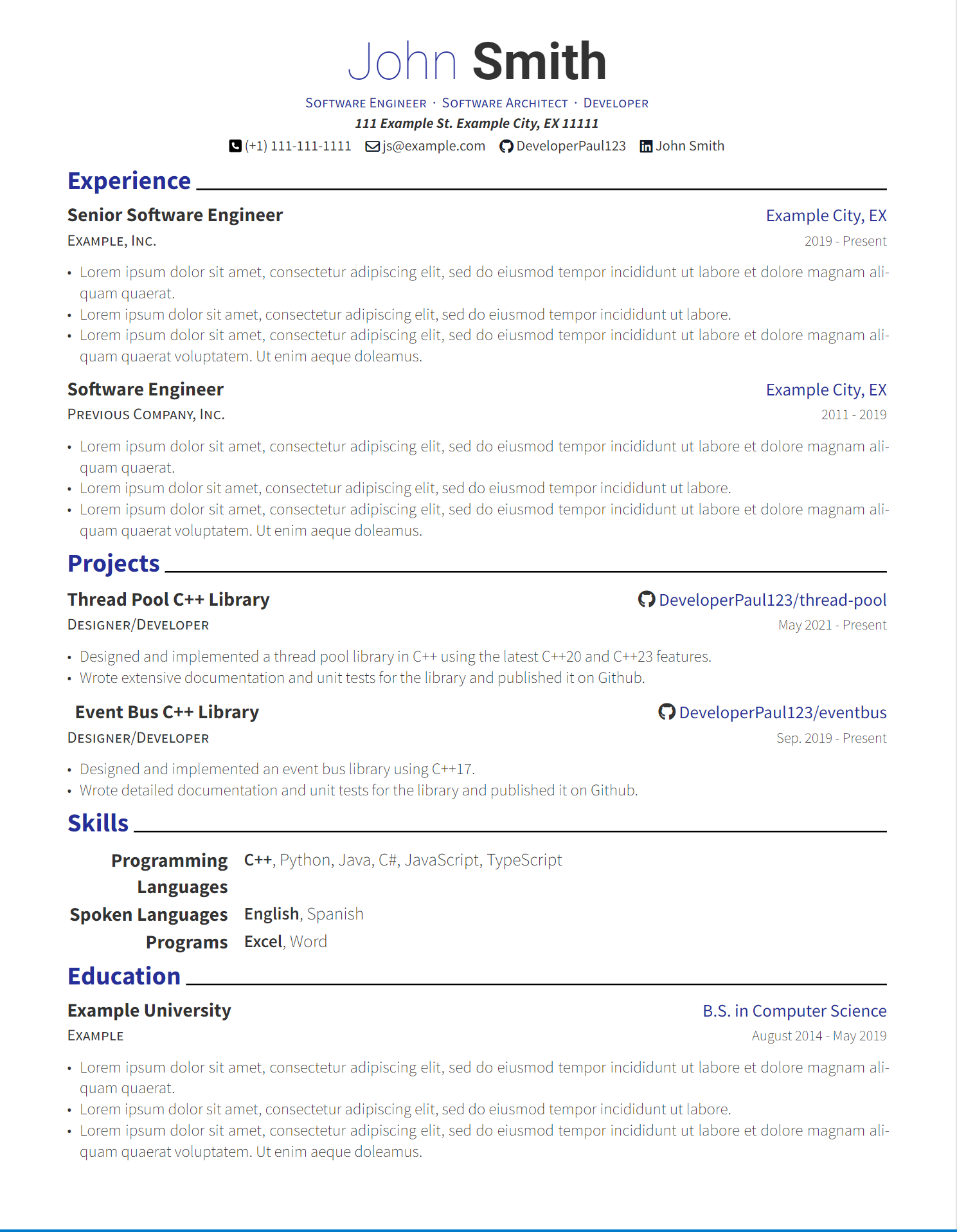
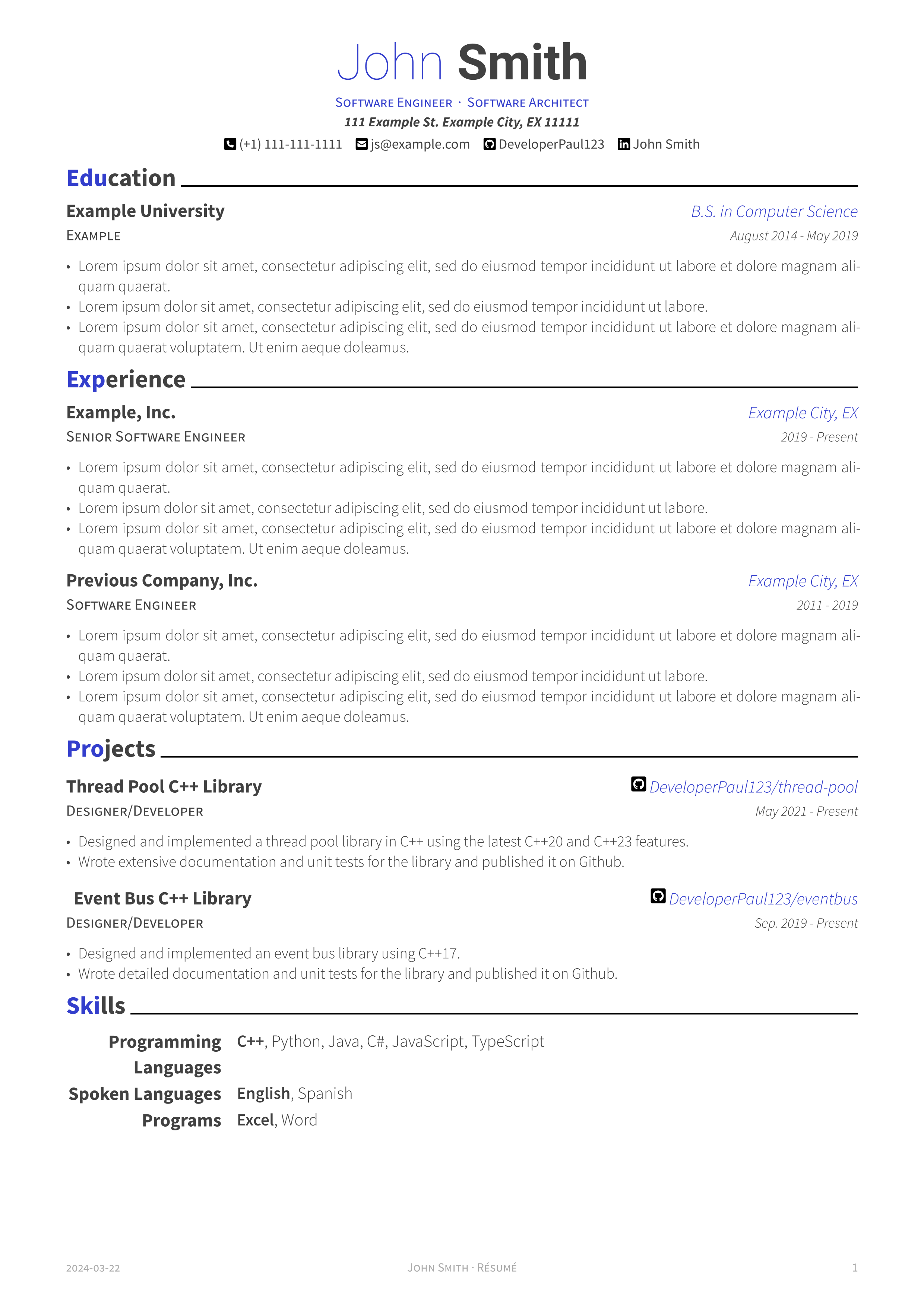
I’m working on some of the changes your suggested. Here are screenshots of the adjustments. I’m curious to hear your thoughts. Thanks!
Here is a monochrome version without colored headers. I also adjusted the default accent color, but this is user configurable as well.
